< back to home
< back to sitemap
I have some of my art from the end of July forward here in reverse chronological order. Sometimes I upload in groups, so there might be multiple days added at a time. (Latest addition is one image on November 14th)
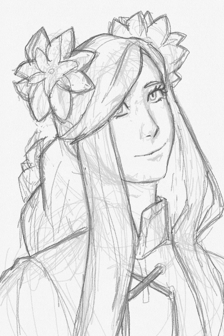
i've been knitting some swatches the past few days to get more familiar with some techniques before i need to use them on my larger project and radiant dawn has been a song i kept returning to while working on them, so like a fool i was like "okay if i'm gonna listen to her theme so much i should at least finally draw her new design it looks so fun!" this drawing would not let me go until it was done but it was worth it because i was right she is fun. need to work on not ending up not eating when i get into a drawing but i did at least eat after
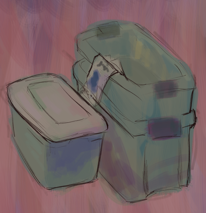
on the same canvas as the previous drawing, i was gearing up for a bit more drang drawing which didn't go well, but i do like this still life i did of some bins that are in my room right now too warm up for it
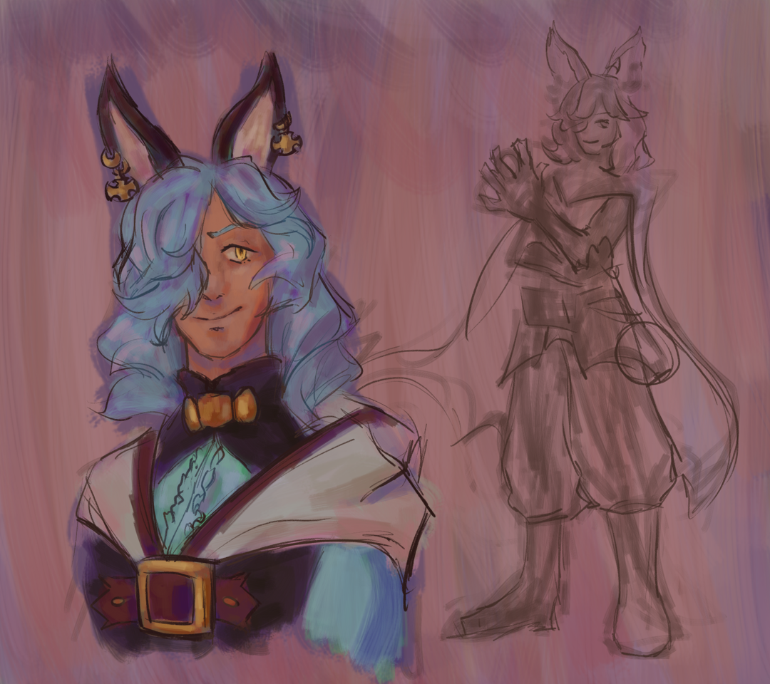
i got into granblue recently because of actually seeing vane beyond just scrolling past his portrait when i would check the free rotation on dustloop in a recent video by milpy, being immediately hooked on him (beefy ray of sunshine with a fuckhuge axe, i don't know how clear it's been made so far but frankly it feels like he was made in a lab to appeal to me both as a character and gameplay-wise) and then finding out that granblue is fully browser-based and thus would take no storage. along the way i was endeared to drang. he's fun i like him. i'm also much more open to lineart to the point i look forward to it, and i've been getting back to underpainting and i like where things are headed
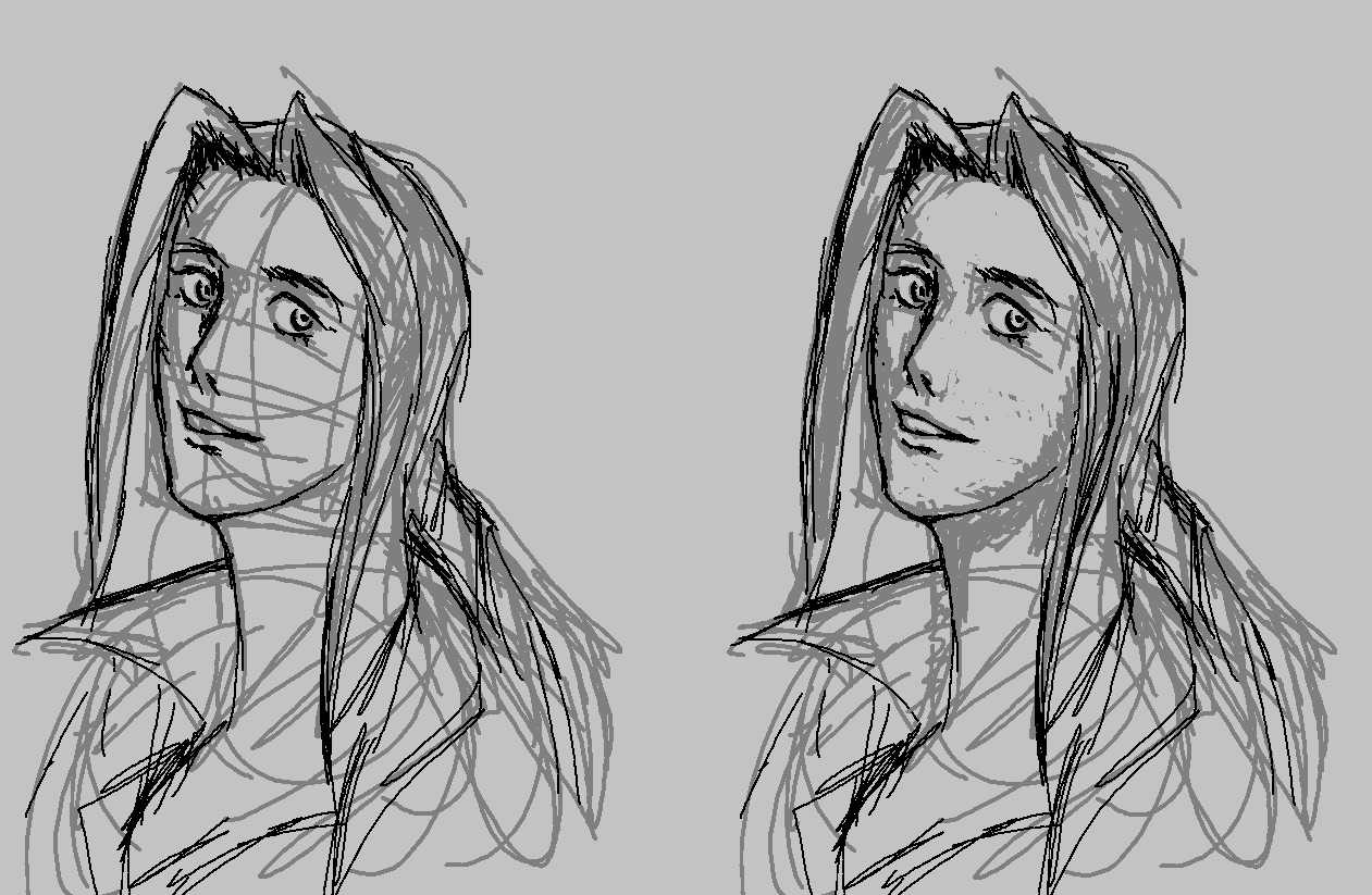
random ms paint doodle in the middle of a different drawing where i was like "hm... what about hair that doesn't care about physics. shoutout to hair vents". i also started refining it a bit but then i didn't want to anymore. i feel like i ended up drawing way more like bishounen anime style than i'm used to and i was like "???" but i also had begun watching a lot of excelblem and it's mainly been fates because it's one of the games i'm not really concerned about spoilers for so maybe it's like the exposure

|

|
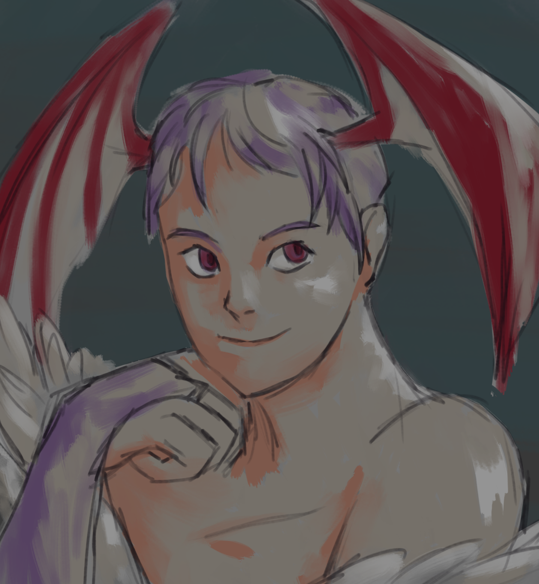
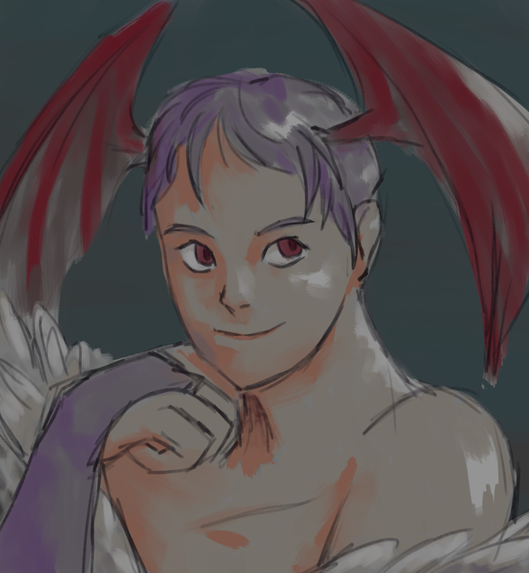
in terms of actually making it, art has been going slow because i'm trying to take it easy on my hands, but i think i've hit a good point in terms of my satisfaction with it. i like my construction more, i found a way to do lineart that i enjoy, and i'm just kind of messing around a bit more. for this, i played with saturation, having the base tones be almost gray but picking way more vibrant colors for the shadows because i wanted to see how it would look, and then for the highlights i went with almost white. by the time i put down the skin i was like "oh this is kind of watercolor-y" and i also thought it would be interesting to just use one base color for everything and then use the colors i picked out for the shadows, which is the first image. the second one is what i originally planned, with each base color being distinct. i had fun and i think i'd like to keep doing my colors this way, along with other ideas i've had
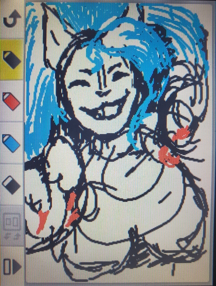
later, i drew felicia in game notes on the 3ds. i actually doodle kind of often in game notes, and felicia is nice for it because her palette lines up with the whopping THREE colors you have in it. honestly i don't think i ever really used it for its intended purpose. it's relatively fast to get to if i'm using my 3ds (which i have been lately. did you know it's super easy to mod your 3ds?) and i think the limitations help me both to just kind of draw and also to not get too sucked into any given piece, which tends to happen if i ever think to myself "oh, i'll just draw something quickly" on my phone which has like one and a half standard art programs. i could get the actual raw image if i exported it and transferred it to my computer, but it's faster and easier to just take a picture, so for today it is the rare and coveted Phone Camera photo. i do this for most of the game notes drawings i like and want to keep in some form because you can only have a handful of them and i have to clear them out eventually
|
|
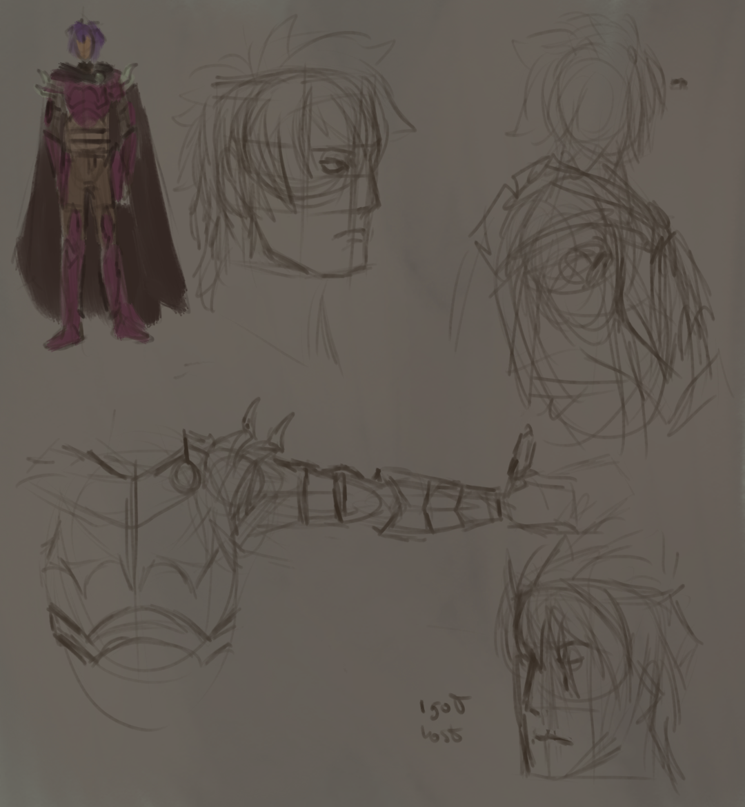
last month was kind of a rollercoaster artistically, going from neutral to demotivated to like ravenous upon coming to realize solutions to things that bothered me. that latest mood led me to draw frankly way too much, but in that stretch of time i became way more satisfied with what was happening in my art, and now i'm stuck waiting for my wrists to feel better so i don't overwork them before i can do what i was preparing for with these. i started replaying fe15, since my first experience ended up being a bit fragmented and i also was curious about deen, and seeing just how many dread fighters celica has on her side inspired me to work on another silly redraw/study. i actually didn't plan to put these up because one of the things i was struggling with was how i construct faces and there were recent changes to my approach that made these feel outdated already, but since i posted them elsewhere i decided i might as well have them up here too, if for no other reason than to record it as a step in my progress
|
|
|
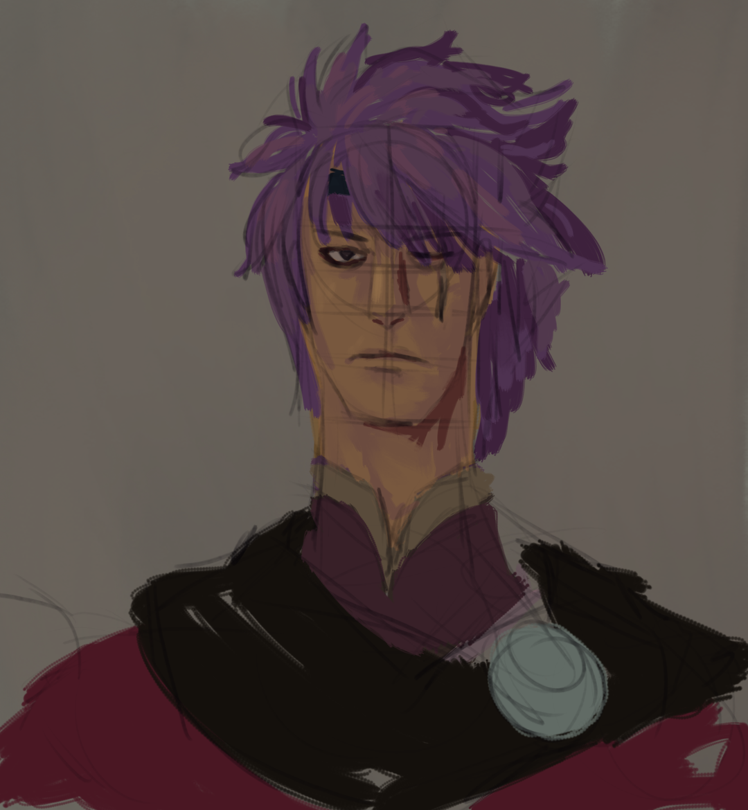
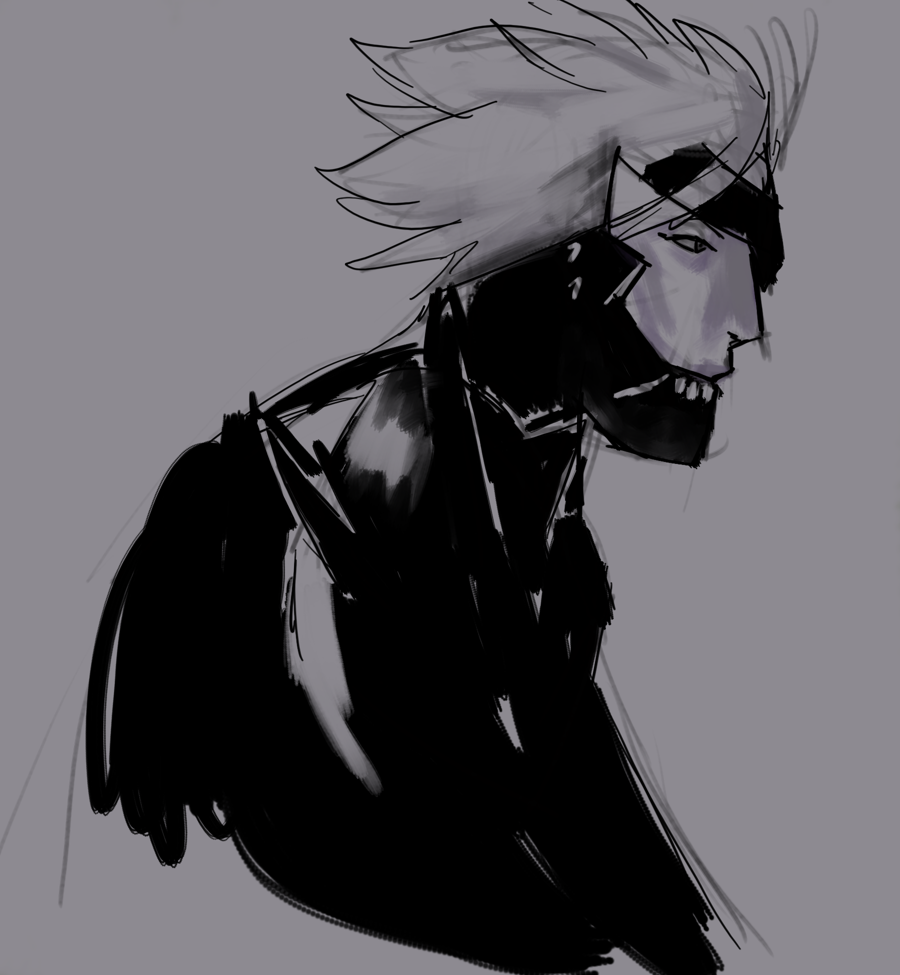
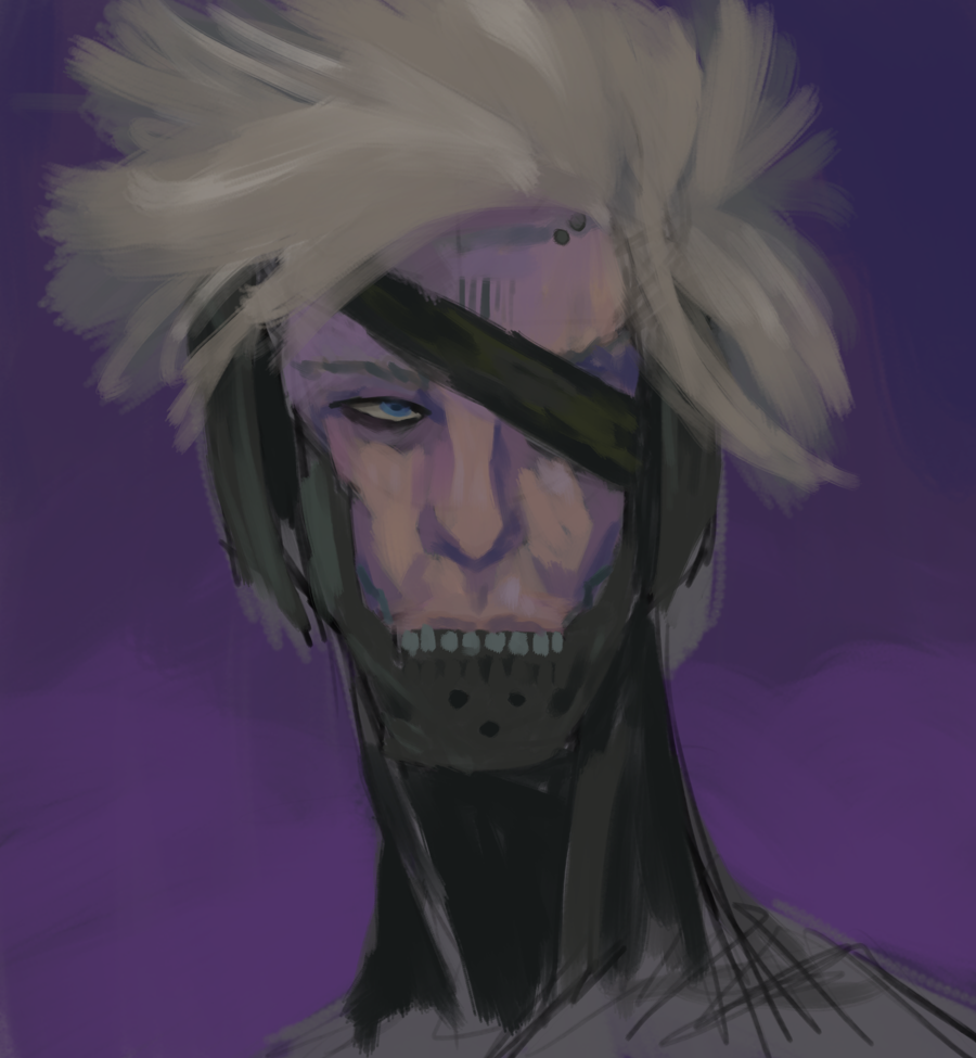
apparently the answer was "listen to metallica and draw mgr raiden". i have not played any metal gear and my knowledge mainly comes from absorbing incidental information over years of exposure to people who know more about it than i do and enjoying funnywes videos, but yoji shinkawa's art also is part of what i know about it. i will be real i picked raiden partially because i was like "theres like 5 different snakes and i think i'd like to know how that works out as close to in context as possible" and partly because i just think the sort of exposed-looking bottom part of the face looks cool and i wanted to try it. i think this fixed everything
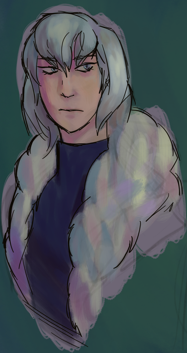
I've been in a rut for a bit. Did some studies and stuff, and I'd have ideas when I was away from my computer (even drawing things on my 3ds) but the moment I sit down at my tablet all the interesting compositions in my head immediately go away. I've also wanted to try incorporating more ink-like lineart into my work, and at the very least I think I'm more satisfied with how that goes than before, but I'm definitely in the thick of art block. It's not lost on me how every image I've shared here is "blorbo from the middle of the torso (at most) up", but most everything else I've drawn I'm either not really feeling or it's more personal and I don't really want to share. I'll overcome it eventually I guess.
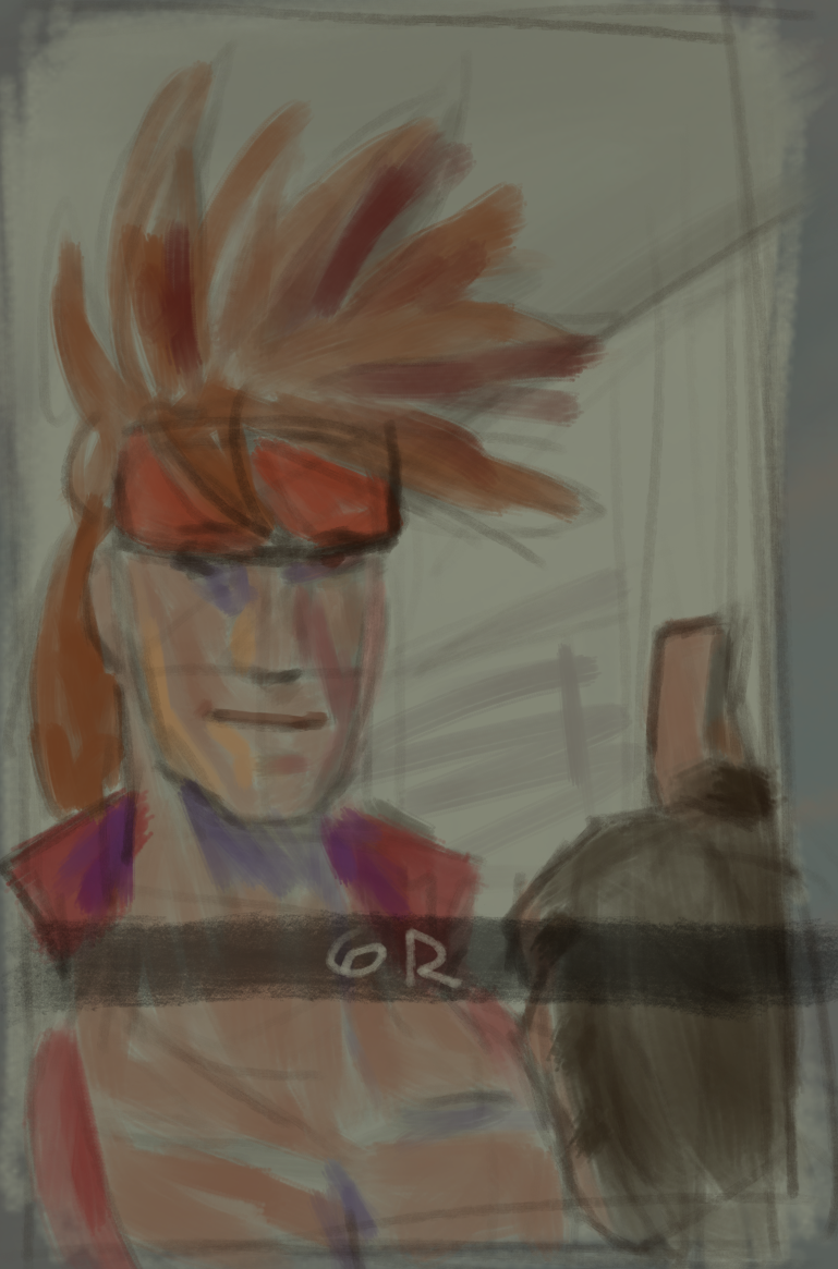
Warming up for something else, I decided to do the calmer counterpart to that meme and see if I could keep it quick but still get the colors down. I did this in about 30 minutes based on the fact that I was done around the time the 30 minute song extension I was listening to ended. They cooked in FE Echoes, I hope they do it again. Anyways I did think of something more fitting than the water this time. Just a thumbs up. He does this. I've been trying to be more mindful of my value range and where I use the extremes (both dark and light) in a piece and also broaden my range of saturation, even if only sparingly, and hues in a given part. Also! Finally back working in Krita again. I officially use Two Brushes instead of the singular one I used near exclusively in it since like the end of last year. Pencil-6 Quick Shade and Wet Textured Soft my beloved
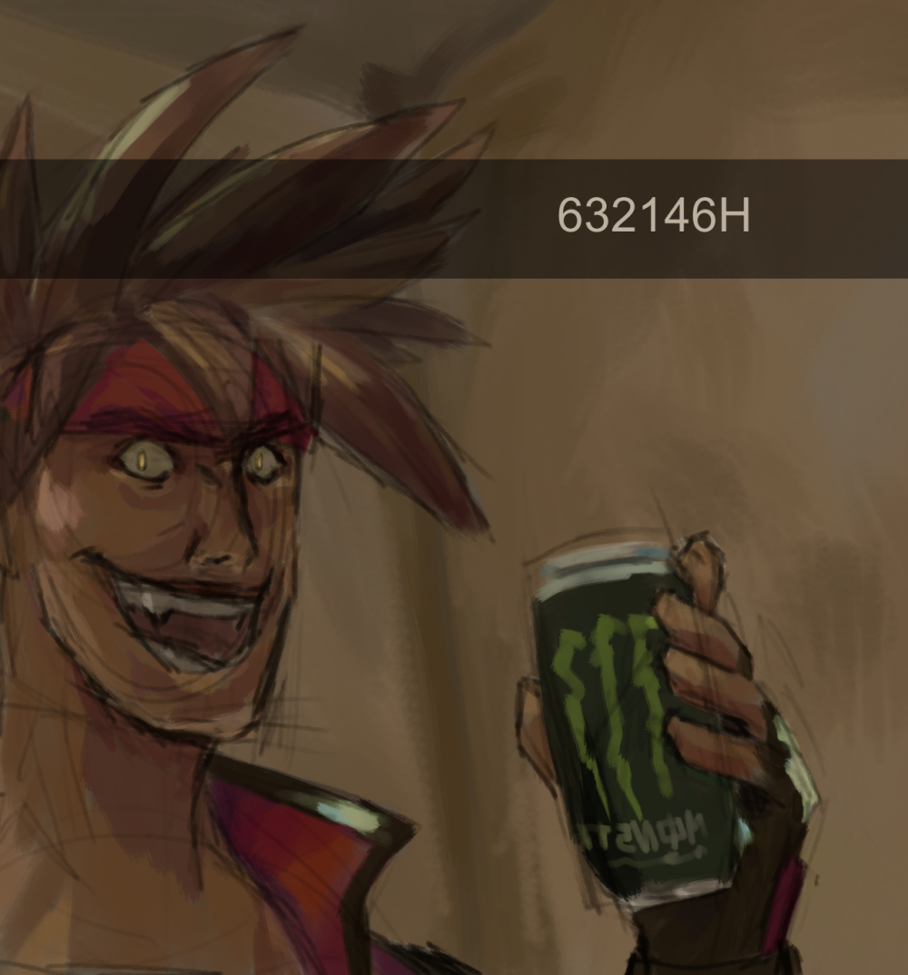
I had plans to draw something else, but inspiration struck and I went into this. I'm currently a Sol main and I drew this because I thought the way I see low health and I'm immediately like "What if Tyrant Rave" regardless of if it's actually a good idea was funny, and I wanted to see if I could externalize that sort of moment. It's a redraw of that guy going "KILL" and that's why Sol is just kind of randomly holding Monster. I didn't feel like doing the hand again like a fourth time so I just left it as a can and I didn't end up thinking of anything that fit better so I decided to just stick to the original image rather than like leave it blank.
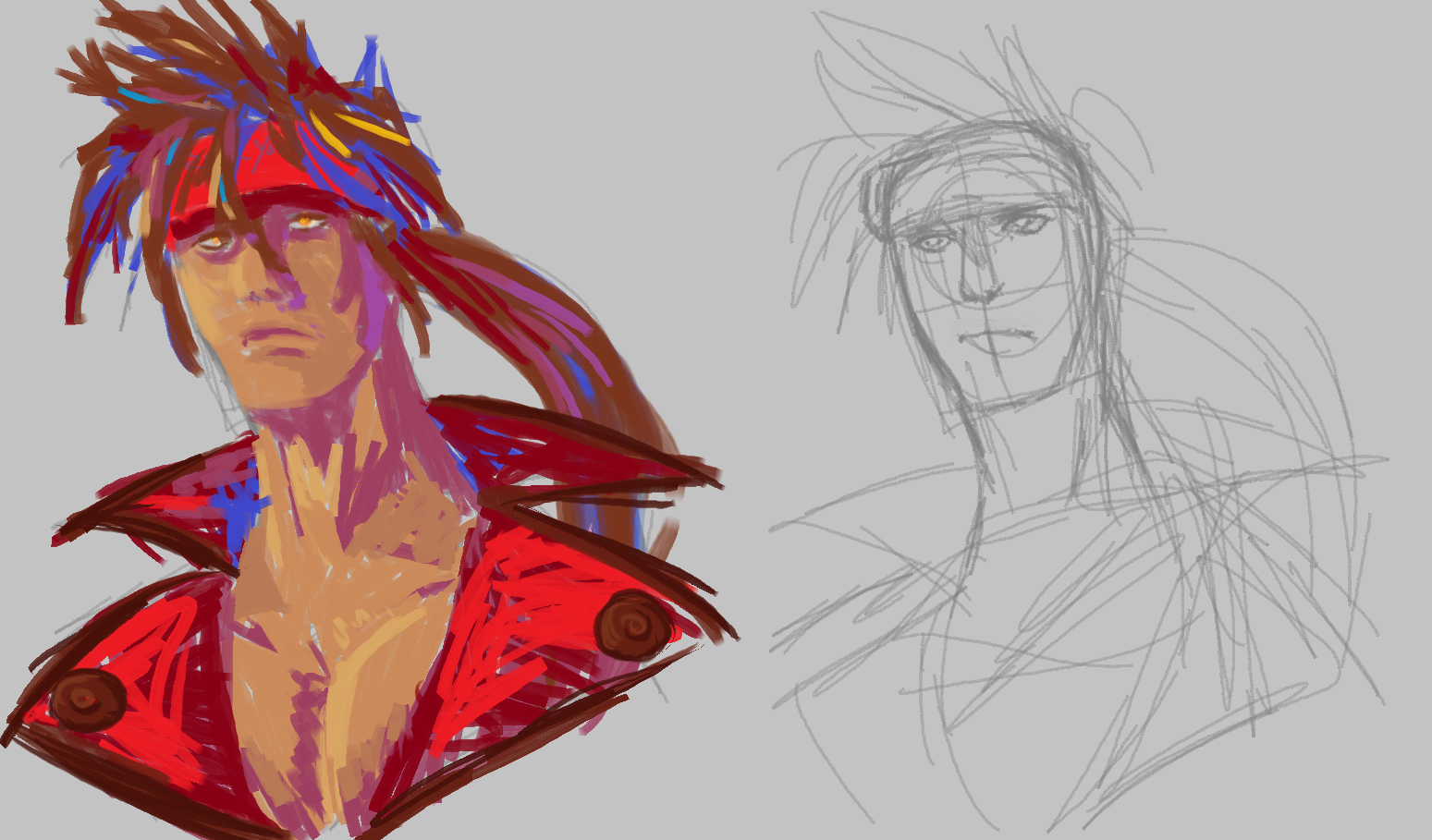
Rather than wanting to take a break from something I was working on, this time I had already taken a break and was warming up with something quick and rough to get back into it. I ended up liking this more, and I'm leaving that one be. I liked the idea, but I think I just need to take a step back and do some studies, which I've been wanting to do for a while but I just kind of end up not doing. Anyways, I mixed using the default colors with picking out some for things that weren't there, but also trying not to get too caught up in having the perfect specific tone, and also used different brushes. I'm a bit torn between using tighter and more constrained color palettes or just going apeshit. I think the generally high saturation of MS Paint's default colors helps pull me a bit out of more muted colors that I tend toward, but it can also be a little strong... I don't know. It'll take experimentation.
That said it's a bit unfortunate that I keep being more into the things I make outside of my main program. I use Krita mostly, and it's not like I have nothing I've done in it recently, but I guess that's also the nature of it being where I do more involved pieces (except for Elphelt who basically invited herself into Medibang)
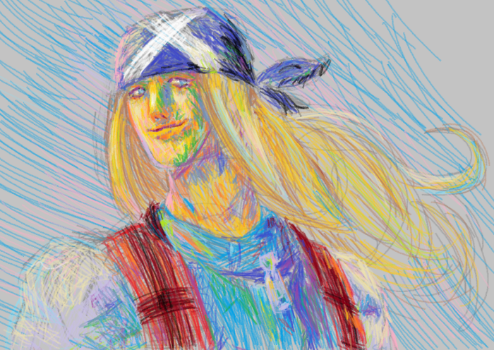
I was drawing something else and I was like "okay I want a break from this I'm gonna draw something quick in MS Paint". It was not quick. Well, relatively it was, I actually was recording as I drew and I think the whole thing was about 2 hours, but I was thinking it was going to be 10 minutes and then back to the main thing, instead of it becoming the main thing. Anyways, by the end of the sketch I thought it would be interesting to see how working with only the default MS Paint colors would be. I had fun figuring out how I wanted to handle tones that weren't really within that palette and I also started doing little studies off to the side and in general I think I learned a lot from this.
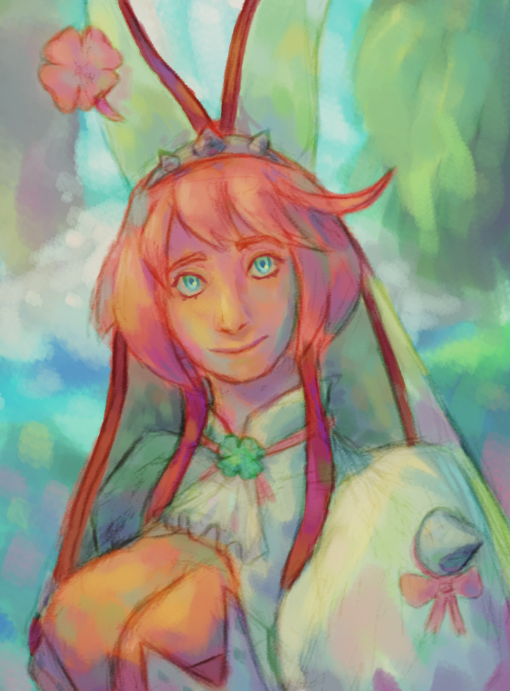
I woke up one day at 3am and I don't remember exactly why but I just started drawing Elphelt on my phone. It turned out to be a drawing that felt pretty good so I kept at it and actually did full-on lineart, something I usually try to avoid doing on my phone because it's not good for my wrists. In the process of making this, I watched this video by luckyqilin (also available in text form on Clip Studio Tips) and found the two value structure described in it really helpful. I often struggled with balancing form and color when shading because I wasn't really sure how to divide areas and this was a really helpful way to break it up.